
Thursday, September 30, 2010
Thursday, September 23, 2010
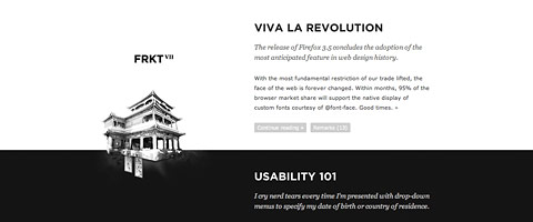
Eye Candy for Designers
Graphics for Nike's "From Moon To Lunar" Exhibition

Lookbook for Carhartt

Weeds Poster

Miami Vice Poster

Thriller Poster


Lookbook for Carhartt

Weeds Poster

Miami Vice Poster

Thriller Poster

Tuesday, September 21, 2010


Tuesday, September 7, 2010
Good Design and Bad Design
Starting with the bad

This "club flyer" style of design is one that consistently bothers me, the elements in the design are always really unorganized and it looks like the designer has a lack of concept and creativity.

I think this one is self explanatory as to why it's bad. It comes from the Pen and Pixel design company that created those terrible album covers of No Limit Records and Cash Money Records. There are just too many elements in the design and I think that if the design took a simple approach it would be much more easier to take in as a viewer.
Now the good design

The simple elements in this design brought elegance to McDonald's and I think that being able to use simplicity in a design is what can make or break it.

This design is just clever. I love how the Lego pieces just look like a simple pile of bricks, until you look closer and see a dragon, which justifies the use of the Medieval typeface for the tagline.
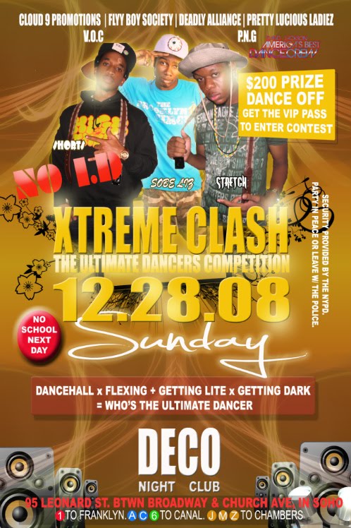
Subscribe to:
Posts (Atom)