Tuesday, December 7, 2010

A few of my favorite album covers.


I really love the handdrawn illustrations and as a fan of the Wu-Tang Clan, I can appreciate the black and yellow color scheme.


A nice simple cover with a subtle touch from artist KAWS. Kanye has always been design conscious with his album covers.


I don't know why but I really like this album cover. It's something about the illustration.


While I have no clue how the baby implies being "ready to die", I have always loved this cover it's simplicity and use of negative space.


The type treatment and the "teasing" of the group by simply photographing their iconic hats is what makes this album cover great, in my opinion.

Sunday, December 5, 2010

“Each week I feel as though I must check in at/with…”

Popular Blogs like Hypebeast.com and Complex.com, since both of these blogs are what I consider to be the online meccas of urban culture, in terms of art, design, fashion, and music. These sites have inspired me in some sort of way, be it through fashion or through art and design, as they do features on artists I'm inspired by like KAWS and Obey.

Details Magazine


Details is an American monthly men's magazine published by Condé Nast Publications, founded in 1982. Though primarily a magazine devoted to fashion and lifestyle, Details also features reports on relevant social and political issues.

I was introduced to Details when I was in high school. My parents always get free magazines in the mail since they used to own a salon and one day the magazine was just there with the rest of the mail. Then, I couldn't really appreciate the minimal and clean aesthetic that Details possessed but after I wanted to study Graphic Design, I began to become inspired by the visuals of the spreads and pictorials I saw in the publication. Not only was I inspired as a designer but I was also inspired sartorially as well, as the magazine gives great style tips that I've used to help improve my fashion.

To this day, I still follow Details and receive a great deal of inspiration from the magazine, especially for the Editorial Design class.

Details.com

Tuesday, November 2, 2010

My Workspace


Here is my place to design and be inspired by many types of music. And yes that is the dated Apple iBook G4 in the picture and I am currently accepting donations towards a new iMac. Seriously. :)

Tuesday, October 19, 2010

Calligraffiti


Calligraffiti is a combination of calligraphy and graffiti. Calligraphy is about the art of writing and can have many forms. Whether it be Japanese ancient brush characters, Arabic pictorial scripts, illuminated mediaeval books or swirly quill writing… all calligraphy.

Graffiti is the art of getting your (pseudo) name up in an urban environment. Perfected in New York City and now a worldwide phenomenon.

The fairly new art of Graffiti and its somewhat rigid rules prompt us to look further back into the history of writing. This is exactly what Niels Shoe Meulman has been doing since his teens, and at the beginning of this century he started combining the two. Thus resulting in Calligraffiti: traditional handwriting with a metropolitan attitude.

Thursday, October 14, 2010

Wednesday, October 13, 2010

MD 20/20 Redesign Creative Brief


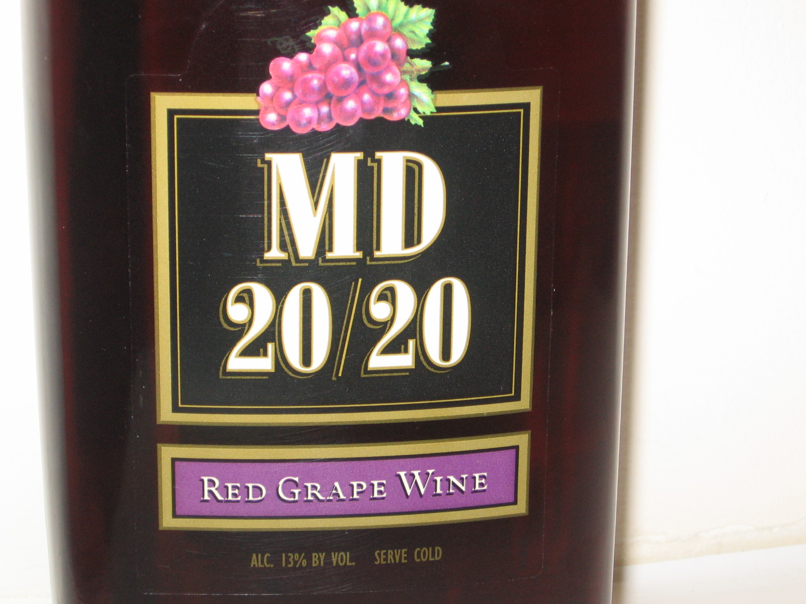
Mogen David 20/20, or MD 20/20, is a wine with a reputation. A bad reputation. It's a low-end fortified wine, which basically classifies it as a lower level product in the world of wine. However, the beverage has somewhat of a cult following that allows it to have popularity through its infamy. But it's graphics are too weak to even attract consumers who are ignorant to the perils of drinking MD 20/20.

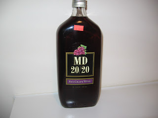
Part of the problem with MD 20/20 is that it's graphic identity is almost non-existent, and the elements that are there are weak. The brand's namesake looks very dated with it's use of the golden boxes and the drop shadows, as well as the illustration of the grapes that represent the flavor. And the bottle shape gives off the look of apothecary medicines, which adds to the low class look of the wine.

To fix these issues, I'm going to pursue a look that will bring an upscale look to the product, even though the product itself is not considered an upscale beverage. My first method of doing so will be to introduce to consumers what "MD" stands for by adding the name Mogen David to the bottle to support the "MD" initials, which will help get rid of the wine being nicknamed Mad Dog. Another solution would be to integrate the Roman numeral "XX" to replace the 20, as I feel the "XX" has a beautiful and bold form that will give an upscale feel to the product. In the end, I hope to turn MD 20/20 into a hip drink that can be an alternative to a Carlos Rossi wine and even harder popular spirits, like Ciroc, Nuvo, and Hypnotiq.

My goal in redesigning MD 20/20 is to create a look for the product that will make it the staple beverage of hip gatherings and club scenes, being by enjoy twenty-somethings looking to live it up with their friends. Even though I can't change the product itself.

Gap Logo Debacle

Here is a link from BBC News on the recent issue of the American retailer, Gap, changing their logo and then ultimately switching to the original logo.

In my opinion, the switch to Helvetica did aid the brand in stepping towards a modern look, but I don't think the font should be outside of the blue box because that element is what make the original Gap logo iconic.

Thursday, September 23, 2010

Eye Candy for Designers

Graphics for Nike's "From Moon To Lunar" Exhibition


Lookbook for Carhartt


Weeds Poster


Miami Vice Poster


Thriller Poster

Tuesday, September 21, 2010

Design Trends

Textured Background


Custom Font Embedding


Serif Fonts


Minimalism and Grid


Big Headings


Tuesday, September 7, 2010

Good Design and Bad Design

Starting with the bad


This "club flyer" style of design is one that consistently bothers me, the elements in the design are always really unorganized and it looks like the designer has a lack of concept and creativity.


I think this one is self explanatory as to why it's bad. It comes from the Pen and Pixel design company that created those terrible album covers of No Limit Records and Cash Money Records. There are just too many elements in the design and I think that if the design took a simple approach it would be much more easier to take in as a viewer.

Now the good design


The simple elements in this design brought elegance to McDonald's and I think that being able to use simplicity in a design is what can make or break it.


This design is just clever. I love how the Lego pieces just look like a simple pile of bricks, until you look closer and see a dragon, which justifies the use of the Medieval typeface for the tagline.

Wednesday, August 25, 2010

My 5 Strongest Pieces

These pieces I'm displaying are what I believe to be, my strongest pieces that help me achieve my goal of entering the Georgia State University B.F.A. Graphic Design Program.


My personal logo is a design I struggled with at first but I feel that the final version displays my understanding of simple and modern aesthetic.


This typography-based piece is one I created to display my typographic skills.


This is one of two designs from the advertisement series I designed for Moods Music for the GRD 3200 Rebranding Project. Advertising Design is something I have a real passion for and I feel like my strongest pieces are the advertisements I've created.


This play poster design for Chicago is a piece I feel shows my ability to create composition within a design.


Lastly, this advertisement series I designed for the eco-friendly package redesign of Jay Z's the Blueprint 3 is what I consider to be my strongest piece so far. It's one that I feel best represents my style of design, with it's usage of composition and modern simplicity.