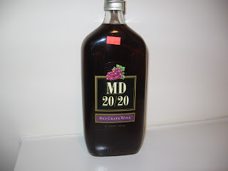

Mogen David 20/20, or MD 20/20, is a wine with a reputation. A bad reputation. It's a low-end fortified wine, which basically classifies it as a lower level product in the world of wine. However, the beverage has somewhat of a cult following that allows it to have popularity through its infamy. But it's graphics are too weak to even attract consumers who are ignorant to the perils of drinking MD 20/20.
Part of the problem with MD 20/20 is that it's graphic identity is almost non-existent, and the elements that are there are weak. The brand's namesake looks very dated with it's use of the golden boxes and the drop shadows, as well as the illustration of the grapes that represent the flavor. And the bottle shape gives off the look of apothecary medicines, which adds to the low class look of the wine.
To fix these issues, I'm going to pursue a look that will bring an upscale look to the product, even though the product itself is not considered an upscale beverage. My first method of doing so will be to introduce to consumers what "MD" stands for by adding the name Mogen David to the bottle to support the "MD" initials, which will help get rid of the wine being nicknamed Mad Dog. Another solution would be to integrate the Roman numeral "XX" to replace the 20, as I feel the "XX" has a beautiful and bold form that will give an upscale feel to the product. In the end, I hope to turn MD 20/20 into a hip drink that can be an alternative to a Carlos Rossi wine and even harder popular spirits, like Ciroc, Nuvo, and Hypnotiq.
My goal in redesigning MD 20/20 is to create a look for the product that will make it the staple beverage of hip gatherings and club scenes, being by enjoy twenty-somethings looking to live it up with their friends. Even though I can't change the product itself.


